Shooting Society logo

Timeline: 3 weeks (2018)
Role: Freelance Designer
Tools: Illustrator, Sketch, Photoshop
Strzelec Wrocław is a collective from Wroclaw and the surrounding area interested in recreational activities involving proficiency tests of accuracy, precision, and speed in shooting using various types of firearms.
(It’s legal in Poland to shoot at the shooting range - every adult and child can shoot in the presence of a legal guardian)
The brief:
- Friendly logo
- Showing recreational shooting.
- Simple enough to embroider for club patches
The History & Idea:
Before we begin with the process, I would like to tell you a bit more about this project as it’s one of my favourites. This is mainly because of the history, process, idea, and overall experience.
this project started pretty basic; I designed couple of logo variations which were very simple, but they they were not particularly special.
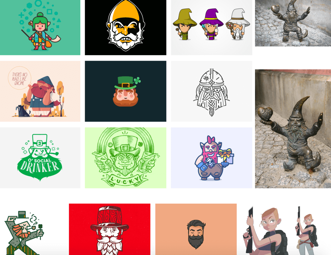
The customer didn’t really have any ideas what they wanted so they did a little bit soul searching. They came up with the idea to incorporate Gnomes in the project. Sounds weird, but there is a bit of history behind it. One of Wrocław’s most memorable and funkiest attractions are Gnomes. There are a couple of stories and tales about how it started; the historic one talks about the Orange Alternative movement, but I personally prefer the version about gnomes fighting a goblin :) You can read more about the gnomes of Wroclaw in this BBC article about the gnomes, their history and the artwork around them.
Inspirations:
Research:
Research included finding different type of gun and gnome shapes. I was trying to find some style the client would like. Would it be linear, flat or a cartoonish type of illustration? The client was very much inclined to use a shape of an old retro pistol.
The Idea:
At this point the idea was very clear, I wanted to incorporate the vision of the gnome, holding retro pistols. I was inspired by the story of gnomes fighting the gobiln, so I decided to gave him angry facial expression. In a developed version of the illustration I gave him an Orange hat as a nod to the other historical origin.
The problem:
The customer loved the logo, but there was one big issue they had with it. Anyone who hold guns like this should never have a finger on the trigger, an important safety measure that's drilled into members.
They also weren’t a fan of the orange hat, and wanted to see how it would look inside the circle for the morale patch.
Final result:
I adjusted the shape to be round, removed the fingers from the triggers and decided to go more with the tactical hat pattern on the illustration.


