Oodls

Timeline: 2 weeks (2018)
Role: Freelance Designer
Tools: Illustrator, Sketch
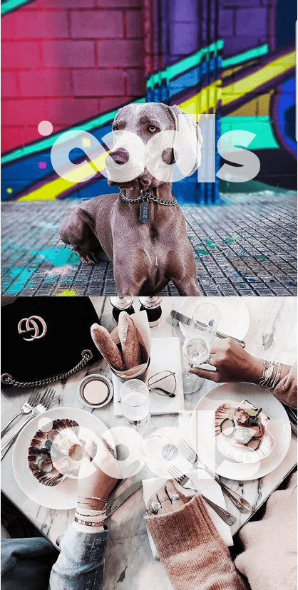
Oodls is a Scottish startup that provides stock images by allowing Instagrammers the opportunity to monetise their content through their Instagram accounts.
The brief:
- Minimalistic logo, showing stock photography.
- Word mark for watermarking stock imagery
- Symbol/icon for the app, software and social media
- Capturing the phrase “oodles of photos”
Research:
The first step was to check out the competition and see what’s out there on the market. Most of the well known companies providing stock images use very simplistic word marks with distinctive minimalistic shapes included. This was exactly what the customer wanted and requested in their brief, but it's also my opinion that a stand-alone symbol can sometimes look outdated, and that the approach of embedding the symbol within the word mark often looks more modern and minimalistic. This was very much in keeping with the sort of progressive concept behind their business.

The Idea:
The name of the company came from the word Oodles, which means a large quantity. The first idea that popped into my head was the infinity sign that symbolises, well, an infinite number of things, which is a great complement to the company name.
As they are providing stock images I thought the incorporation of a camera symbol would be a great fit. I playing around with a number of variations; experimenting with the camera shape, shutter symbol, viewfinder of the camera. I was looking for a very small yet very distinctive element that would be striking and stand out.
There is one of them that stands out the most for me. It included the infinity symbol, camera element, and double line that indicated both directions of the business: providing stock photography for everyone, and business opportunities for Instagrammers. It also worked the best as a symbol — a combination of the infinity sign, and a camera icon — which also functioned as a nod to the Instagram app logo, a platform on which the business depends. In the end I decided to show this iteration of the logo in my first presentation.
The problem:
Turns out the idea was great, but the double line was not very visible when scaled. When tested with a group of people, they couldn’t discern the name of the company at the smaller size, which was obviously quite a big issue. The customer liked the shape and the idea behind it so I decided to simplify the logo even more and ditch the idea of the double line for the sake of legibility.
Another iteration was tested:
This version was much improved, but there was still an issue: when scaled we found it was read as either “oools” or “oods”. A new issue also arose: as a stock image company they need to use their logo as a word mark and it became apparent that this version of the logo was not very visible as a watermark, and was too easy to remove from images.
Final result:
In the end I decided to make the logo much thicker than we had planned for the original. This way the watermark on the photos would be easily visible and not as easily removed. This logo looked more legible and stable.


Additionally:
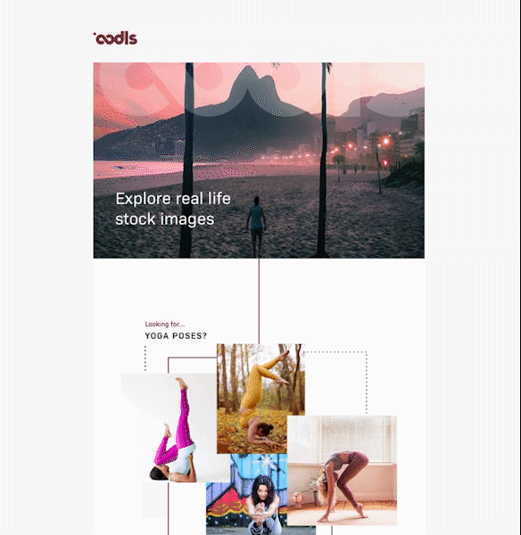
Later in a year I collaborated with them again on their email templates. Since their emails are focused more on the photography I decided to keep it very minimalistic, and similar to their website. At the email footer I included a selection of their most popular collections.