Data collection and marketing tool platform

Timeline: 6 months initially (2019) - constant improvement
Role: Product Designer
Tools: Sketch, Invision, Full Story
BLACKBX (now Stampede) is a software as a service (SaaS) company providing customer insights and effective digital marketing automation tools through data collection from their public Wifi offering.
The brief:
- improving existing software
- better data overview
- creating new features
- UI design system
Previous software design:


General Problems:
- lack of dashboard overview
- difficult navigation
- messy nav (3 different setups in 3 different places, configuring software, data capture and setting up the network)
- design not suitable for extensive data, or for accommodating new feature development
- sidebar nav was changing confusingly as the user navigated the site
Research:
The first step was to understand how the existing platform worked for its users. Understanding how it was being used, which were the main features people were interested in, and which devices they use it on the most. The company is using Full Story to see user’s behaviours.
I invested effort into researching best practices for providing navigable data sets within these forms of dashboards so that I could start our unique offering from a foundation of proven approaches.

Process:
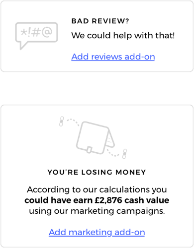
- main dashboard overview + showing extra addons and their value

- bringing back side nav (from an older version)

Problem 1 - Configuring the software:
I found the original approach was too long, complicated and confusing for users. It overwhelmed them. I condensed this into a stepwise process that gathered the controls in a series of very simple questions to avoid confusion.


Problem 2 - Filtering data:
The filter panel started to get too long with too many options to remain constantly visible. I decided to add a sliding panel on the right so it doesn’t take up space that could otherwise be used to display data.
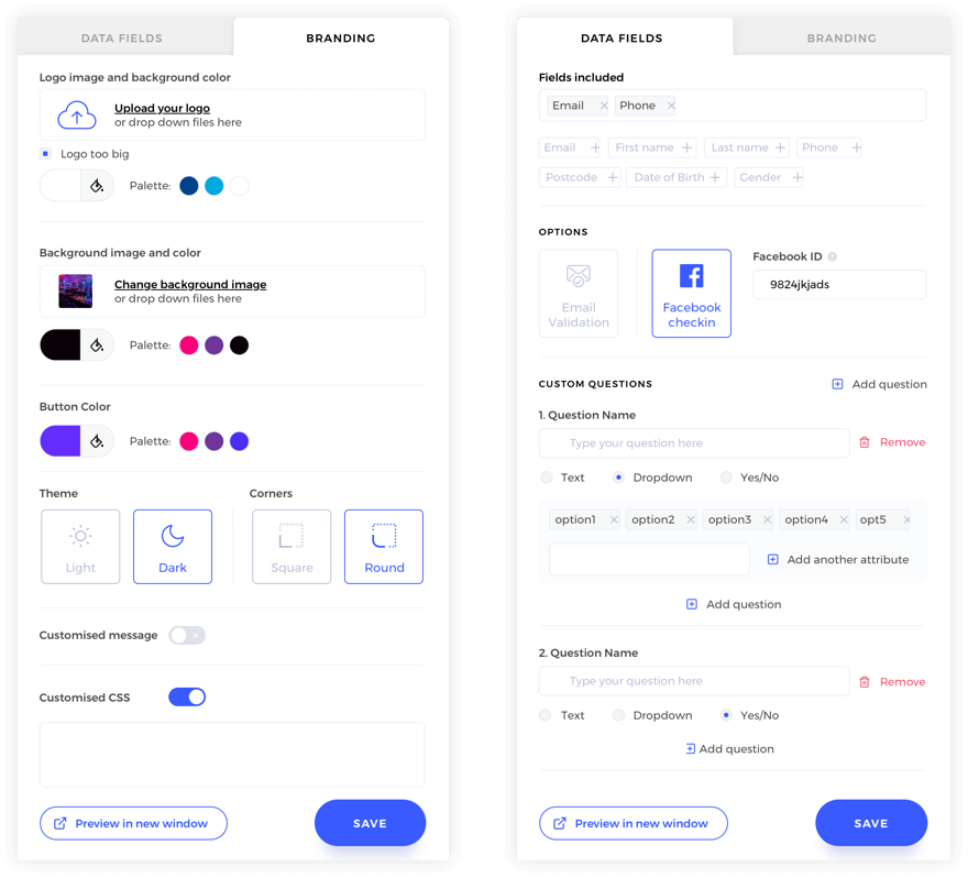
Problem 3 - Guest Wifi data capture customisation:
This was one of the general problems with setting up the data capture, which spread the various elements needed to complete the setup - from what data was gathered, to how the forms were presented - across multiple sections of the site. I collected all of these into one segment that allows the data capture requirements to be determined alongside their visual representation in a single place.
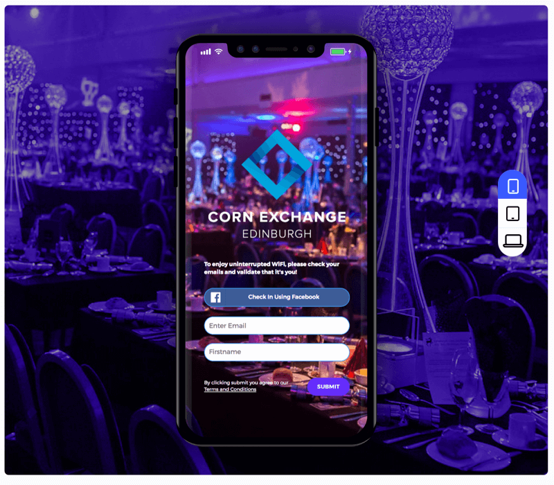
I decided to make the data capture and branding panel in one, with a generic preview on the right hand side available for a variety of devices.
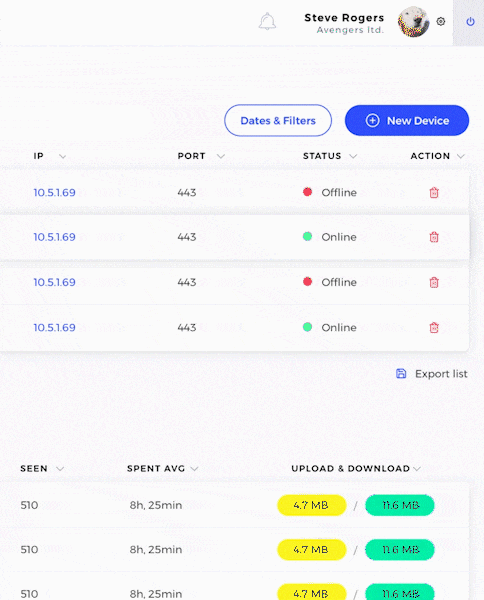
Problem 4 - Individual user overview:
The previous version made it very difficult to block individual users from your guest wifi once they had logged in, something that customers wanted as it was an effective means to prevent hogging. I came up with the individual user's view that provided the customer with a timeline of the user's usage and the controls to either block them, or end their current session.

On boarding:
We decided to introduce an on-boarding process so the users can get up to speed with the new design quicker.
This lets them reach higher productivity levels much faster than if they had to figure everything out on their own. It also allows us a way of introducing new features to the user.

Cancellation survey:
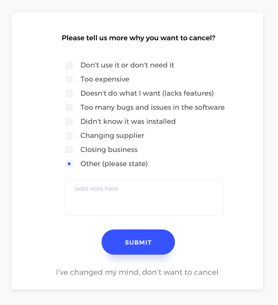
We introduced a cancellation survey. This helped us identify any problems, gave a range of solution for the CS team how to approach the customer and therefore saved us some churn.
Final result
Update:
At the moment we’re conducting customer interviews and user testing this design - because of the time pressure we had to wait with this until after the new release. There is still lots to be improved, and few new features to be developed. Product design is a constant improvement for the user.